


The org chart is not the organization
An org chart shows reporting lines. It does not show influence, dependency or exposure — which is where large organizations actually get stuck.

Every large organization has a diagram of itself. Boxes, lines, a hierarchy that
resolves cleanly to one box at the top. It is genuinely useful for a narrow set of
questions — who approves this, who signs that, whose budget does it come out of.
It is close to useless for the questions that actually stall decisions. Who has to
be convinced before this moves? What breaks downstream if we change it? Which
external party has more influence over this outcome than anyone on our side of the
diagram? None of those are reporting-line questions, and none of them are visible
in a chart of reporting lines.
will land.
Three things the chart leaves out
Influence that doesn’t follow authority. In most organizations of
any age there are people whose agreement is functionally required and who appear
nowhere near the top of the diagram — the engineer who has maintained the system
for eleven years, the regional lead whose objection has never been overruled. The
chart cannot represent them because it only draws one kind of edge.
Dependency that runs sideways. Reporting lines run vertically.
Almost every consequential dependency runs across: this programme depends on that
contract, which depends on a partner nobody in this room employs. Read vertically,
a lateral dependency is invisible right up until it fails.
Everything outside the boundary. The org chart stops at the
organization’s edge, which is precisely where most of the risk lives. Regulators,
municipalities, installation partners, resellers, the agency that owns the physical
site your equipment is mounted on — none of them fit in the diagram, and all of
them can stop a programme.
What a map does differently
A map has no privileged direction. People, organizations, assets, projects and
locations are the same kind of object, and the edges between them can be any
relationship worth naming — ownership, influence, contract, governance, exposure.
Nothing has to be forced into a hierarchy it does not actually have.
That sounds abstract until you watch someone use one. The question stops being
“where does this sit in the structure?” and becomes “what is this connected to?” —
which is the question people were trying to ask in the first place.
Illustrative data.
Geography is not decoration
There is a reason the map is a map and not a node diagram. Once an organization
operates in more than one place, a surprising proportion of its real constraints
are geographic: which jurisdiction, which municipality, which physical site, which
partner has coverage there. A force-directed graph will happily place two things
next to each other that are two thousand kilometres apart.
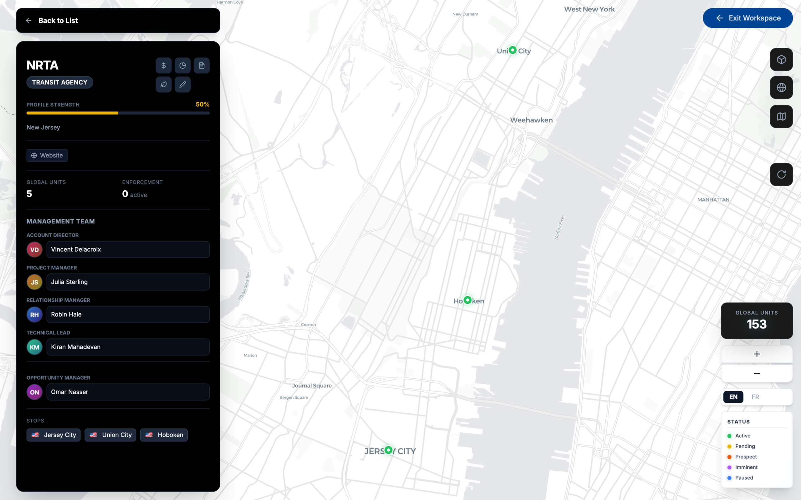
Putting the model on real geography means spatial questions answer themselves.
Coverage gaps look like empty space. Concentration looks like a cluster. Nobody has
to be told to notice either.
The point is the shared reading
The value of a system model is not that one analyst can now see the system. It is
that everyone is looking at the same one. Once the map is the shared artefact, a
meeting can start from the position rather than spending its first half establishing
what is true — and disagreements become disagreements about the decision rather than
about the data.
The org chart survives because it answers a real question. It just answers a much
smaller one than we ask of it.